A few weeks ago I submitted my PhD thesis, which I have written in LaTeX. LaTeX is probably the best and most established open-source type setting solution for academical purposes, but it is also a relic from ancient times. The syntax is a more or less a nightmare, you need to remember many small things to create typographically correct documents, the compilation process is a mess, and an enormous amount of packages for all kinds of things exists and you need to know which of the packages is currently the best alternative for your needs. For the quite sizable document that I have written, I took a reasonable amount of time to find out how to do all these things properly and this blog post will summarize my (subjective) set of best practices that I have applied for my document. This is not a complete introduction to LaTeX but rather a somewhat structured list of thing to (not) do and packages (not) to use. So you need to know at least the basics of LaTeX.
Building LaTeX Documents
The first thing you have to do before being able to see a LaTeX document is to compile your document into (probably) a PDF. This process is a total mess in LaTeX and depending on the features and packages you use, requires multiple iterations of calling the compiler with some call to utility programs at the right time in between. This is highly complicated and hard to get right. Don’t even dare to create a custom Makefile for this purpose. I have seen countless examples of broken Makefiles for LaTeX that miss parts of these iterations, swallow important messages, or do not recover from errors. Instead, use an established build tool specifically crafted for LaTeX. A few options exist such as rubber (Ever tried googling for latex and rubber to get help?), arara or latexrun. However, my impression with all of them is that they are more or less unmaintained and lack important features. Thus, the only viable option is to use the Perl-based latexmk, which is one of the oldest build tools. It is included in every major LaTeX distribution.
latexmk is configured through a latexmkrc file besides your main document..
This file is a Perl script.
Probably the first thing you have to do is to set PDF mode (who still uses DVI?):
$pdf_mode = 1;
In case your project contains custom classes that need to be added to the tex search path, you can use something like:
$ENV{'TEXINPUTS'}='./texmf//:';
Btw, the double slash instructs LaTeX to also search all subfolders of the specified texmf folder.
After configuring latexmk, you have multiple options how to compile your document.
If you want a single compilation run, a latexmk main.tex should be enough.
However, the real power of latexmk is continuous compilation.
If you start it with latexmk -pvc main.tex, latexmk compiles your document, opens a PDF viewer and from then on continuously monitors your document (with all included files and images) for changes and updates your preview on the fly.
In case something got stuck and you need to clean your document folder from intermediate files, you can of course use your VCS (git clean -fdx) or latexmk via latexmk -C main.tex.
Generating Images and Other Files
One common issue that often arises is that you have some images or other artifacts that should end up in the document, but they are in a format that is not compatible with LaTeX. Thus, you first have to convert them to a different format (for instance, PDF for vector graphics or JPEG for pixel images). People usually do this conversion manually and put the resulting files into their VCS, too. But as usual with generated files, in case someone changes the source image, you have to remember to manually regenerate the LaTeX-compatible output file, too.
With latexmk you can get rid of this manual and error-prone process by letting the build tool do the conversion automatically.
For this, you have to configure conversion rules in the latexmkrc file.
These rules used file extensions.
In case a document contains a reference to foo.pdf (e.g., an \includegraphics{foo.pdf}) and this file doesn’t exist in the source tree, latexmk uses the available conversion rules to find a file with the same basename that can be generated into the desired PDF file.
For instance, automatically converting SVG vector images and Graphviz .dot files to PDF can be achieved with these rules in the latexmkrc:
add_cus_dep('svg', 'pdf', 0, 'svg2pdf');
sub svg2pdf {
    system("inkscape --export-area-drawing --export-pdf=\"$_[0].pdf\" \"$_[0].svg\"");
}

add_cus_dep('dot', 'pdf', 0, 'dot2pdf');
sub dot2pdf {
    system("dot -T pdf -o \"$_[0].pdf\" \"$_[0].dot\"");
}
You can even generate LaTeX sources from other documents in case you have tools that output the required .tex files.
I have used this to automatically convert online questionnaires to TeX for the appendix of my thesis using my own quexmltolatex:
add_cus_dep('quexml', 'tex', 0, 'quexml2tex');
sub quexml2tex {
    system("quexmltolatex -p \"${\basename($_[0])}\" \"$_[0].quexml\" > \"$_[0].tex\"");
}
Another currently popular tool for diagrams is draw.io. With the following rule and my own drawio-batch you can automatically convert those diagrams to PDF:
add_cus_dep('xml', 'pdf', 0, 'drawio2pdf');
sub drawio2pdf {
    system("drawio-batch -f pdf \"$_[0].xml\" \"$_[0].pdf\"");
}
For further useful conversion rules, have a look at this GitHub repository.
After configuring images for automatic generation, remember to exclude the generated outputs from your VCS (.gitignore).
In case you want latexmk to clean up the generated images on -C as well, the following setting is required:
$cleanup_includes_cusdep_generated = 1;
File Conventions
Properly Use UTF-8
In ancient times, using non-ASCII characters in LaTeX documents was a nightmare and special codes like \"a had to be used in case you wanted an ä.
This is still documented this way in many places on the internet, despite being horrible to type and to read.
Nowadays, you can more or less safely use common umlauts etc. by using UTF-8 encoded files with the correct header declaration:
\usepackage[utf8]{inputenc}
\usepackage[T1]{fontenc}
Another common source for problems with umlauts is the bibliography. The ancient BibTeX has many issues with UTF-8. However, BibLaTeX and biber (see below) are designed to work with UTF-8.
Put Each Sentence on a Single Line
Apart from using UTF-8 consistently, I recommend following the convention of placing a single sentence of your document per line of the source file.
The rationale is that this make VCS diffs easily readable without requiring additional options like --word-diff for git to track changes.
This would be necessary if you put each paragraph into a single line or, even worse, if you configure your editor to automatically rewrap paragraphs at something like 80 characters line length.
Don’t do this.
Even a single change at the beginning of a paragraph can reformat the whole paragraph then, resulting in massive and unreadable diffs.
Citations
Citations are a necessity for scientific work and BibTeX has been used since ages for generating the necessary bibliographies and citations. Most conference templates still use it today. However, BibTeX has some serious issues. Apart from the aforementioned lack of UTF-8 support, modifying style files is hard and it lacks support for many important fields in the database entries. Thus, there are some replacements for BibTeX, with natbib previously being a good guess. However, nowadays BibLaTeX (mind the difference, which Google loves to swallow) is probably the most versatile and handy solution you can and should use.
Basic Configuration
The most important thing to do is to use BibLaTeX together with the biber .bib file processor instead of the old bibtex binary.
Only this way you gain full UTF-8 support, document validation, filtering capabilities.
Thus, you should load the package at least with the backend=biber option (should be the default in modern versions).
\usepackage[backend=biber,style=alphabetic]{biblatex}
This way, you can use UTF-8 safely in your .bib files.
Database Entries
BibLaTeX has an extended set of entry types and fields in the database, which is very well documented in the “Database Guide” section of the BibLaTeX manual.
For instance, new types include @online for websites, @patent for patents, @standard for standardization documents, and @report for research reports.
Moreover, many new fields for entries exist that make filtering the database easier and give bibliography and citation styles more possibilities to include the relevant information in an appropriate format.
Especially the doi field is important nowadays support readers in finding the exact publications you are referring to.
A more ore less complete entry for a conference paper for BibLaTeX might look like this:
@inproceedings{Yu2015,
    author = {Yu, Jingjin and Aslam, Javed and Karaman, Sertac and Rus, Daniela},
    bookpagination = {page},
    booktitle = {IEEE/RSJ International Conference on Intelligent Robots and Systems (IROS)},
    date = {2015},
    doi = {10.1109/IROS.2015.7354122},
    eventdate = {2015-09-28/2015-10-02},
    eventtitle = {2015 IEEE/RSJ International Conference on Intelligent Robots and Systems (IROS)},
    isbn = {978-1-4799-9994-1},
    pages = {5279--5286},
    publisher = {IEEE},
    title = {Anytime planning of optimal schedules for a mobile sensing robot},
    venue = {Hamburg, Germany}
}
All database entries are based on a declared schema, which can also be validated by biber using the --validate-datamodel command line switch.
This can be enabled in the latexmkrc file by overriding the default biber call:
$biber = 'biber --validate-datamodel %O %S';
This way, errors in the bibliography database will automatically be reported.
Regarding the contents of individual entry fields in the database, there are still some common pitfalls and illogical things being documented in other places:
Double curly braces instruct BibLaTeX/BibTeX to interpret a string or value exactly as written. You don’t want to do this everywhere automatically. For instance, this prevents name parsing and
{{Peter Miller}}will not be sorted along his surname, neither will his forename be abbreviated in styles that do so. Moreover, setting paper title in double curly braces will also disable the automatic title case in the IEEE style.In case you are citing documents in different languages, define at least the
langidfield of the entry to ensure that proper hyphenation is used in the bibliography.langidis passed to the [babel] package. Thus, all identifiers that [babel] supports are accepted here (e.g.,american,french,british).The same identifiers can also be used in the
languagefield to add a note to bibliography entries in case a cited document is in a different language than the document itself. Unfortunately, the values here are not validated by biber. You can add the following code to your preamble to ensure that the provided language is known by BibLaTeX (hopefully this will still work in the future):\makeatletter \DeclareIndexListFormat{language}{% \ifboolexpr{ test {\ifbibstring{#1}} or test {\ifbibstring{lang#1}} } {} {\blx@warning@noline{Unknown language '#1' in 'language' field of\MessageBreak '\thefield{entrykey}'}}} \AtDataInput{\indexlist{language}} \makeatother
Advanced Citation Commands
Although you could continue to simply use \cite to cite bibliography content, BibLaTeX has a lot more utility commands to simplify common situations.
Generally, it is a good idea to switch over to the \autocite command.
The behavior of this command (inline citation, footnote, etc.) can be configured using a pacakge option.
Thus, you can easily change the way citations are printed with a single change to package options.
In case you want to use a publication as a subject or object in a sentence, \textcite can be used.
This command will automatically insert (depending on the configured citation style) something like the author names so that a real subject exists.
For instance, “\Textcite{Foo1999} shows that” might result in: “Foo and Bar [FB99] shows that”.
The capitalized versions of the commands ensure that the resulting text starts with a capital letter at the beginning of sentences.
It is also possible to extract individual keys from bibliography entries using special citations commands.
In case you want to highlight a seminal book or something like that you can use \citetitle and author names can be gathered using \citeauthor.
This way, things are not duplicated and potential typos can be corrected in a single place.
Filtering and Mapping Bibliographies
Often, you do not maintain your .bib file manually but instead you use a reference manager like Mendeley or Citavi.
Thus, you only have limited control of what will end up in the generated file.
For instance, the entry Yu2015 shown above is generated by Citavi and contains a huge level of details.
BibLaTeX will happily print all available details in the bibliography and thus even the conference dates will be printed.
This might be acceptable for a longer document, but in a space-limited conference paper, this eats all your space and might also violate the publication guidelines.
You could delete the offending keys for the .bib file manually, but that has to be redone every time you regenerate the database.
Moreover, if you share the .bib file between different documents with different requirements on the printed fields, this won’t work at all.
Fortunately, BibLaTeX in combination with biber allows declaring filters and maps to fix up such issues. In your preamble you can use something like the following to delete fields depending on the entry types:
\DeclareSourcemap{
    \maps[datatype=bibtex]{
        % remove fields that are always useless
        \map{
            \step[fieldset=abstract, null]
            \step[fieldset=pagetotal, null]
        }
        % remove URLs for types that are primarily printed
        \map{
            \pernottype{software}
            \pernottype{online}
            \pernottype{report}
            \pernottype{techreport}
            \pernottype{standard}
            \pernottype{manual}
            \pernottype{misc}
            \step[fieldset=url, null]
            \step[fieldset=urldate, null]
        }
        \map{
            \pertype{inproceedings}
            % remove mostly redundant conference information
            \step[fieldset=venue, null]
            \step[fieldset=eventdate, null]
            \step[fieldset=eventtitle, null]
            % do not show ISBN for proceedings
            \step[fieldset=isbn, null]
            % Citavi bug
            \step[fieldset=volume, null]
        }
    }
}
As you can see with the volume field in @inproceedings, this can also be used to fix at least some of the annoying errors that most reference managers do.
Btw, for Citavi, be sure to use the export style for BibLaTeX and not the BibTeX one.
Another useful application for source maps is to find your own publication in a list of publications based on the author name for printing a separate list of these publications.
\map[overwrite=true]{
    \step[fieldsource=author, match=Wienke, final]
    \step[fieldset=keywords, fieldvalue=ownpub]
}
With this map, every publication containing my surname in the author field gets the keyword ownpub.
I can then use something along the following lines to put my own publications in front of the general bibliography:
\printbibliography[heading=bibintoc,keyword=ownpub,title={Own publications}]{}
\printbibliography[heading=bibintoc,notkeyword=ownpub,title={Other publications}]{}
Achieving Typographically Correct Results
In some situations you have to know what you are doing to achieve results that correctly reflect the rules of typography. Some of those are of general nature, but some also are specific to LaTeX.
Dashes
Typography knows different types of dashes and not every dash you will be using is represented as a minus sign in the source code. LaTeX know the following dashes:
-: a hyphen so combine compound words or for hyphenation--: en-dash, somewhat longer than the hyphen---: em-dash, even longer
Different people promote different rules for when to use these different dashes. Just have a look at this Stackexchange question to get an impression of the different schools, pick the convention that you like best and apply it consistently. Knowing the difference and using the different visual pauses the dashes types create in the text flow consistently and with purpose is the most important aspect.
Spaces
LaTeX distinguishes between different types of spaces. Depending on the conventions commonly used in different countries, spaces between words might smaller than the ones between sentences. Thus, LaTeX must be able to distinguish these two types. Generally, a space is treated as an inter-word space as long as the character before the space is not a period. A period is thus interpreted as the end of a sentence and the following space is assumed to be an inter-sentence space. Thus, if you use an abbreviation with a period at the end, you have instructed LaTeX that this period does not end the current sentence by escaping the following space:
This is a sentence w.\ a forced inter-word space.
If you don’t do this, you randomly get larger spaces after abbreviations that interrupt the visual flow.
One exception to this rule is if the period is preceded by a capital letter.
In this case, LaTeX assumes an abbreviation and continues to use an inter-word space.
You can reverse this behavior by placing an \@ before the period.
This is done by XYZ\@. This is a new sentence.
If you are using common abbreviations in English, e.g. this one, i.e. exempli gratia, you can use the foreign package to get commands that handle the spacing correctly:
\usepackage[abbreviations,british]{foreign}

...

This is an example, \eg{} spacing is right here.
british in the package options here means that no comma is placed automatically behind the abbreviations.
Quotation Marks
Placing correct quotation marks requires some thought, especially in other languages than English. For instance, in German you would have to type this to get correct opening and closing marks:
\glqq{}this is the quoted text\grqq{}
If you want to avoid remembering how each language and publisher style handles quotation marks, simply use the csquotes package, which automatically selects the correct way for the current document language:
\textquote{this is the quoted text}
If the quotation is actually from another publication that has to be cited, you can use the following shortcut to also get the correct citation through BibLaTeX:
\textcquote[42]{Yu2015}{this is the quoted text}
As you can see, this also supports the typical pre and post notes for BibLaTeX citation commands to place page numbers.
If your quotation is a sentence that ends with a period, some languages have different rules whether to include the period in the quotation marks or not. csquotes can handle these cases automatically (and with configuration options), but you have to indicate the final period manually:
\textcquote[42]{Yu2015}[.]{This is the quoted text and a full sentence with period}
Finally, it is common to strip some parts of quoted material or add annotations to make it understandable in the current context. csquotes provides command for these purposes so that you do not have to remember the exact rules in each language. For instance, to replace some fraction with a summary you can use:
\textcquote[42]{Yu2015}[.]{This is \textelp{garbage} with period}
\textins adds an annotation without indicating the omission of material.
Hyphenation of Hyphenated Words
LaTeX usually automatically hyphenates words automatically.
However, this behavior is switched off as soon as the work contains a hyphen to create a compound word such as architecture-aware.
Suddenly, LaTeX will not hyphenate the individual parts, despite knowing hyphenation patterns for them.
This will likely result in overfull hbox warnings.
The same will also happen for other special characters such as /.
To avoid this issue, the hyphenat package provides commands that still allow hyphenation of individual parts.
Thus, architecture/building-aware becomes:
architecture\fshyp{}building\hyp{}aware
Not exactly nice to read, but it does the job.
Useful Packages to Achieve Consistency
Some things require consistency and are repetitive and I will shortly introduce some packages for such cases.
Physical Units and Numbers
In case you are typesetting numbers with physical units or numbers in general, some typographic rules have to be followed for a correct representation. Fortunately, the siunitx package implements these rules, selects appropriate ones automatically, and makes them configurable globally. For software engineers, the following package option also load binary units:
\usepackage[binary-units=true]{siunitx}
\sisetup{detect-all}
The second line detect all features of the document font to adapt the number formatting accordingly. Afterwards, you can do such crazy things and everything will be set correctly:
We measure in \si{\kilogram\metre\per\second}.
The brightness was \SI{.23e7}{\candela}.
The experiment resulted in \SIlist{0.13;0.67;0.80}{\milli\metre}.
We need \numlist{10;30;50;70} participants.
The angle was \ang{12.3}.
Printing Dates and Times
If you have to mention dates and times frequently, the datetime2 package provides macros to do this consistently:
\usepackage[useregional]{datetime2}

% ...

We took the measurements at \DTMDate{2017-08-07}.
Inline Enumerations
In case a) you like code structure, b) use inline enumerations, and c) want a package for this, use paralist. This sentence could then be realized as:
In case
\begin{inparaenum}[a)]
    \item you like code structure,
    \item use inline enumerations, and
    \item want a package for this, use paralist.
\end{inparaenum}
Detecting and Handling Warnings (Bad Boxes)
LaTeX is very strict about its typographic rules and in case it can’t make some part of your document fit into the typographic rules, it will generate a warning and will break the rules in the result document. The common result is that line of text will flow out of the text border because no valid hyphenation would result in resolving all constraints. This is a common cause for the “Overfull hbox warnings” most people see and ignore in their documents. While some obviously need fixing, because the page margin gets flooded, others are harder to spot.
So what to do about these issues? First of all, these warnings shouldn’t exist in the final document and in case one of them appears, you should be able to easily spot them. This is best achieved if usually there are no warnings at all. However, many packages create some warnings when being included that can simply not be solved and are acceptable. These warnings flood the error window of your editor and make it hard to detect the actual problems.
Filtering Warnings
To avoid that acceptable warnings hide unacceptable ones, you can use the silence package for hiding warnings based on the source package and string matching for the warning message. As several unfixable warnings appear already when importing packages, it is usually a good idea to include the silence package as the first package:
\RequirePackage{silence}
\WarningFilter{scrreprt}{Usage of package `titlesec'}
\WarningFilter{scrreprt}{Activating an ugly workaround}
\WarningFilter{titlesec}{Non standard sectioning command detected}
\WarningFilter{microtype}{protrusion codes list}
\WarningFilter{latexfont}{Font}
\WarningFilter{latexfont}{Some font shapes}
\documentclass[...]{...}
Obviously Visible Bad Box Warnings
As said, while some overfull hbox warnings can easily be spotted, other are harder to catch. However, when adding the following line to your preamble, a thick black bar marks every line that even slightly violates margins. This makes spotting them much easier.
\overfullrule=2cm
The following image shows the visual result of this setting in case of an overfull hbox.
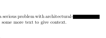
Effect of using overfullrule in LaTeX
Underful hbox Warnings
In contrast to the previous examples, where LaTeX created lines that were too long, you sometimes also get “underfull hbox” warnings.
This happens in case something doesn’t fill the space it should.
A common source for this are manual line breaks using \\.
If you can, avoid these and use better suited constructs where possible.
At least, don’t end a paragraph with a forced line break (\\ followed by an empty line).
This will always create a warning.
Micro-Typographic Improvements.
Even though LaTeX is already pretty good at producing high-quality documents, a single package can still greatly improve the situation: microtype. This package improves the visual appearance of the documents by fiddling with the different spacings on the level of individual letters. This creates a document where the visual weight of the different letters is reflected in the way they are laid out on the page. For instance, the text borders get much smoother this way. Another side effect is, that documents with microtype being enabled usually have less bad boxes.
As a small example, this document compares the layouting of the same text in two narrow columns:
\documentclass[a5paper,twocolumn]{article}

\usepackage[english]{babel}
\usepackage{blindtext}
\usepackage{geometry}
\geometry{
    a4paper,
    total={100mm,257mm},
    left=55mm,
    top=55mm,
    columnsep=2.8cm,
}

\usepackage[activate={true,nocompatibility},final,tracking=true,kerning=true,factor=1100,stretch=10,shrink=10]{microtype}

\begin{document}

\microtypesetup{activate=false}
\blindtext

\newpage

\microtypesetup{activate={true,nocompatibility}}
\blindtext

\end{document}
The compiled result is the following:
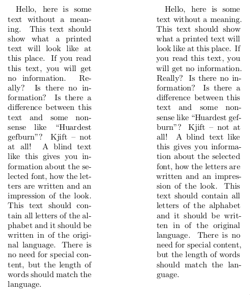
Comparison of text layout without (left) and with microtype (right).
While the left column without microtype enabled produces 4 underfull hbox warnings, the right one has only one.
Moreover, the right border looks a lot less jerky with microtype, partially because less words are hyphenated.
So, whenever possible, it is a good idea to enable microtype.
However, remember that at some places little shifts of individual words and letters might not be desirable.
For instance, the table of contents might be a place where you may want to temporarily disable protrusion using \microtypesetup{protrusion=false}.
Cross-References
Cross-references are a common feature in close to any document. As soon as you have a floating figure, you probably want to reference it from the text. I’ve seen countless documents where people manually added the type of the reference target to the reference. Something along the following lines:
Please refer to Fig.~\ref{fig:xyz}.
First of all, you have to remember to put a non-breaking space (~) to avoid splitting this.
Second, you have to remember for each type of reference, how you refer to it for being consistent.
Was it “Figure”, “figure”, “Fig.”, or “fig.”?
An if you decide to change this convention afterwards, this some manual work across the whole document.
Fortunately, there are different packages that solve this problem
hyperref’s autoref Command
In smaller documents and in case you have no desperate need to modify the default, the \autoref command provided by the popular hyperref package is a solid choice.
The previous example would reduce to:
Please refer to \autoref{fig:xyz}.
Much easier and automatically consistent.
In case you want to change the way a figure is called, this can be done via the following code in the preamble:
\addto\extrasenglish{\def\figureautorefname{Fancy figure}}
In case you want more flexibility, cleveref is a solid package choice.
Automatically Pointing to Pages
In longer documents that are primarily provided in printed form, referring to the number of a figure or chapter might not be enough to make the document easily readable. In case the chapter or figure is further away than the facing page, the reader has to start searching for it and providing a page number will make this much easier. Of course, you can to this manually:
Please refer to \autoref{fig:test} on the facing page.
Please refer to \autoref{fig:bla} on page \pageref{fig:bla}.
But how do you know whether the floating figure really ends up at the facing page or isn’t placed on same page as your reference? In that case, adding a page number just looks silly. The package varioref automates the process of adding these page references. If something close, it adds things like “on the previous/next/page page”, if targets are further ways, a page number is added. All this with some automatic variations to avoid sounding repetitive.
For using varioref, it is best combined with hyperref and cleveref, but a specific order of package imports has to be used:
\usepackage{varioref}
\usepackage{hyperref}
\usepackage{cleveref}
Afterwards, you can use \vref or \Vref to get the automatic references.
Please be warned, varioref is a monster with a disputable maintenance state and some ugly errors that can happen. Yet, I am not aware of a better alternative. Due to the nature of how LaTeX documents are compiled incrementally, you might end up in endless compile loops. Imagine the following situation:
\vrefto a figure sees that this figure is currently placed on the facing page. This, it adds the text “on the facing page”, which is quite long.- The next call to
pdflatexsees the long addition and as a result, the figure moves on page further, references are invalidated again. - varioref now sees that the figure is two pages further. Thus, it decides to use “on page 8” instead, which is shorter.
- The next compile iteration of
pdflatexsees the shorter text and the figure flips back to the facing page.
This process can now continue from the beginning and never stops. Generally, this is a problem that can always appear in LaTeX in case the delayed processing on invalidated references significantly changes the amount of text that is produced. So, in case latexmk stops compiling your document with an error message that the maximum number of passes was exceeded, this is a likely source. The only option to cure this is to change your document in such a way that the reference target will not move around.
As it is sometimes hard to find out which reference causes this issue, you might add the following code to your preamble:
\makeatletter
\def\@testdef #1#2#3{%
  \def\reserved@a{#3}\expandafter \ifx \csname #1@#2\endcsname
 \reserved@a  \else
\typeout{^^Jlabel #2 changed:^^J%
\meaning\reserved@a^^J%
\expandafter\meaning\csname #1@#2\endcsname^^J}%
\@tempswatrue \fi}
\makeatother
At each compile run, this will spit out all references that changed in a compile run.
Compare these outputs between the different compiler invocations (diff) to find the offending labels.
Hyperlinks to Floats and not their Captions
If you use hyperref and provide PDFs digitally, you get nice clickable links. However, for floating environments like figures, these links usually point to the caption text and not to the top of the environment. Thus, it might happen that clicking a link makes the PDF viewer scroll to the caption and the image above is cut off. Your can avoid these issues by loading the package hypcap, which needs to be imported after hyperref.
Code Listings
Providing code listings is a common task in case you are in a technical discipline.
The listings package with its lstlisting environment and lstinputlisting command is a common and simple solutions for this.
However, providing good code highlights is a hard problem and the rules used by this package are pretty simple.
Other, standalone code highlighters provide much better highlights.
The minted package includes the pretty well-known highlighter Pygments to provide nicer highlights.
Just have a look at the output of this test document:
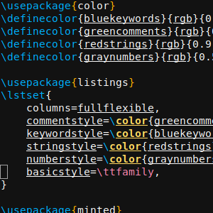
\documentclass[a4paper]{article}

\usepackage[english]{babel}

\usepackage{color}
\definecolor{bluekeywords}{rgb}{0.13, 0.13, 1}
\definecolor{greencomments}{rgb}{0, 0.5, 0}
\definecolor{redstrings}{rgb}{0.9, 0, 0}
\definecolor{graynumbers}{rgb}{0.5, 0.5, 0.5}

\usepackage{listings}
\lstset{
    columns=fullflexible,
    commentstyle=\color{greencomments},
    keywordstyle=\color{bluekeywords},
    stringstyle=\color{redstrings},
    numberstyle=\color{graynumbers},
    basicstyle=\ttfamily\small,
}

\usepackage{minted}

\begin{document}

\section*{listings}
\lstinputlisting[language=python]{test.py}

\section*{minted}
\inputminted{python}{test.py}

\end{document}
For listings, this is the minimal setup required to get colored output with an editor-like appearance. For minted, the defaults already provide nice results:
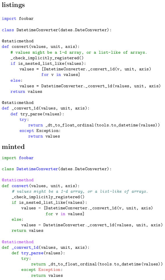
Comparison of listings and minted for highlighting Python code
Pygments does a much better job at highlighting things nicely with the default setup.
As minted relies on an external program for highlighting, of course, you need to ensure that Pygments is installed.
Moreover, the LaTeX compiler has to be instructed to allow calls to external programs.
This can be done in the latexmkrc file by redefining the compiler call to include the -shell-escape flag:
$pdflatex = 'pdflatex -shell-escape -interaction=nonstopmode';
Pretty Tables
For getting nicely looking tables, you should at least use the booktabs package, which defines different rules for the top, the bottom, and in between tables. The package documentation gives some basic hints on how to design tables correctly. Basically, common advices boil down to:
- No vertical lines whenever possible
- Horizontal lines only at the top and bottom of the table and to separate the header and footer
Others have written good and more detailed guides:
- Small Guide to Making Nice Tables
- Publication quality tables in LaTeX
- How to make your tables less terrible: a nice animation, less than a minute
Linting
As you have seen, there are a few common pitfalls and a lot of things you have to remember when using LaTeX. At least for some of the typical issues, linters exist that try to point them out automatically. A good editor should be able to integrate these linters in a way that you get instant feedback.
Linting for LaTeX Issues
For issues regarding the use of LaTeX itself, I recommend chktex, which comes with any major LaTeX distribution. It produces warnings like these:
- Warning 12 in ./chapters/middleware.tex line 605: Interword spacing (`\ ‘) should perhaps be used.
- Warning 8 in ./chapters/faultdetection.tex line 136: Wrong length of dash may have been used.
- Warning 17 in ./appendix/collected-metrics.tex line 629: Number of `(’ doesn’t match the number of `)’!
- Warning 1 in ./chapters/dashboard.tex line 170: Command terminated with space.
- Warning 46 in ./chapters/prediction.tex line 452: Use ( … ) instead of $ … $.
Prose Linting
Apart from linting the technical use of LaTeX, it is also a good idea to look through your prose for common issues. The least and probably well-accepted thing to use is a spell checker. But there are more and interesting tools to use for this purpose as well.
Grammar Checks with LanguageTool
For finding grammar errors in LaTeX documents you can use the pretty good LanguageTool.
This grammar checker works on plain text files.
Obviously, LaTeX is not plain text with all the commands in between.
If your editor doesn’t have a reasonable integration of LanguageTool that strips away all the command (while preserving the exact line and column positions of words), you can take the scripts in this gist as a starting point for a preprocessor and integration with LanguageTool.
detex.py strips away a manually curated list of commands and replaces them with plain text representations that preserve the exact position in the source file (adds multiple spaces if necessary).
detex-python.py is a replacement for the LanguageTool binary that automatically pipes the target file through detex.py before handing the stripped down text to LanguageTool for grammar checking.
If you are lucky, you can configure your editor to use this script instead of the original LanguageTool binary.
Obviously, the set of replaced commands needs to be matched with what you use in your document.
The extra effort this takes is well worth it, as LanguageTool is pretty good at spotting even more complex grammar issues.
Content Linting with Vale
At least for the English language, there are also multiple tools to actually lint the content of your text for common issues such as weasel words, passive voice, potentially offensive speech, etc.
While many exist, my verdict was that all relevant ones can be replaced with Vale, which uses a set of different styles to search for common problems.
The default configuration is pretty lax and doesn’t check much, so you need to search through the styles folder and select additional styles to apply to your text.
These can be put directly into your project and a .vale file is the configuration for the linter.
What I have been using was this config:
StylesPath = .vale-styles
MinAlertLevel = suggestion

[*]
BasedOnStyles = vale, proselint, TheEconomist, 18F, PlainLanguage, mystuff

proselint.Annotations = NO
write-good.E-Prime = NO
write-good.Passive = NO
TheEconomist.UnexpandedAcronyms = NO
TheEconomist.Punctuation = NO
18F.UnexpandedAcronyms = NO
18F.Abbreviations = NO
18F.Contractions = NO
PlainLanguage.Contractions = NO
PlainLanguage.Slash = NO
In mystuff I created a custom style to remind myself for being consistent.
For instance, .vale-style/mystuff/Lists.yml checks that list items start with a capital letter:
extends: existence
message: "Use capital letters for list items"
ignorecase: false
level: warning
raw:
  - \\item(\[.*?\])?\s+([[:lower:]])
.vale-styles/mystuff/ConsistentSpelling.yml was used to check that common terms that I used were written consistently:
extends: substitution
message: Use '%s' instead of '%s'
ignorecase: true
level: warning
swap:
  meta data: metadata
  data set: dataset
  data sets: datasets
  meta model: metamodel
  meta models: metamodels
  timeseries: time series
  data is: data are
  open source: open-source
  opensource: open-source
  run-time: runtime
  run time: runtime
  front-end: front end
  front-ends: front ends
  javascript: JavaScript
  Java Script: JavaScript
Vale doesn’t handle LaTeX commands.
Thus, you also need to put the detex.py before the call to Vale.
However, once this is set up, extending rules is pretty simple and greatly helps to enforce consistency.
Conclusion
I hope this somewhat random list of things regarding writing documents in LaTeX helps someone to improve his writing experience and the final document.Probably, many things are missing here, but there are a lot of further resources around. One important issue here is to look for recent articles and blog posts. Even for such an ancient tool like LaTeX the ecosystem is evolving and better packages appear, others become unmaintained, and some are just not needed anymore with more modern distributions.
In case you have remarks, corrections, or further hints what to add here, feel free to contact me via mail.
Updates
- 2018-06-14: Hints for good tables added
- 2018-06-18: Fix notation for escaping periods after capital letter abbreviations. A backslash was missing.
- 2021-02-13: Updated link for the booktabs manual.